Aparment Interior | One Jackson Square | New York | Kohn Pedersen Fox Associates


Location:New York, NY, USA
Client:Hines
Team:Schuman Lichtenstein Claman Efron, Associate Architect
Type: Interiors, Residential
Size:65,000 ft2 / 6,000 m2

The fluid form of One Jackson Square’s glass façade is carried through to the lobby, where undulating glass is replaced with wood, lending a warm atmosphere to the space. The walls of the lobby are likened to the banks of a river. Just as a river’s edge is eroded by the flow of water, the layered bamboo walls of the lobby are carved and smoothed by the ebb and flow of residents. A detailed 3-D computer .....more

Cafe Interior | Museum Cafe | Roppoggi Tokyo | Klein Dytham Architecture


This is a café in the clouds. It sits on the 52nd floor of Roppongi Hills – overlooking the vast shag-pile in concrete that is Tokyo. The space is organized with low zigzagging walls upholstered in pink leather. It brings a dash of glam and colour to the sleekness of the surroundings.

Sitting in a café with such a outstanding view, it’s hard to keep your attention on your companion’s face. Your eyes keep straying to off the horizon. Rather that try fight this natural impulse, we accentuated it. We created a stepping floor, so those at the back could so over the heads of those nearest the windows. And we added mirrors, to bring some of the view to those unfortunate ones who were still left view-challenged. But not just ordinary mirrors. Convex mirrors used to see around tight street corners in the narrow winding alleys of Tokyo. They provide a gentle reminder of the delights at street-level of the city the café so loftily overlooks.....more

Apartment Interior Design | Claremont Street | South Yarra | Designed By Plus Architecture


Following on from its successful predecessor, 33 Claremont St – SXY2 – will be one of the most recognisable buildings in South Yarra.

The development features 54 boutique apartments over 9 levels, with a communal terrace and bbq area on the rooftop. The apartments create a dynamic and sustainable opportunity for living and working reflective of South Yarra’s character.

The materials are raw and expressive, the design elements combining to create an architectural language reminiscent of its industrial heritage, juxtaposed with swatches of bright colour.

The display suite is scheduled to open in December 2010.....more

The Australian Wildlife Centre Designed By Minifie von Schaik Architect


The Australian Wildlife Centre is a building quite unique in both its function and form. It is both a fully functioning veterinary facility, and a remarkable and compelling experience for Sanctuary visitors.

The building has been designed to bring Healesville visitors into close contact with the vets and their patients to gain a vivid understanding of how sick and injured Australian animals are cared for. From a central space visitors can witness the diagnosis of animals, the work of the laboratory, see animals being operated on, and view them recovering and returning to health. A rich multimedia interpretive experience enables visitors to gain a keen understanding of how animals become injured and the full range of activities involved in their care....more

House Interior | Villa Dali | The Hague, The Netherlands Designed By 123DV Architecture


Capturing the character of Dalí, Jugendstil forms, Spanish facades and nautical life in one villa.

The clients asked for a very personal house which would reflect their passions. They are nautical minded and have a love of art, sculptures and especially the work of Salvador Dalí. During the initial design discussions 123DV architecture were also showed pictures of ancient Spanish architecture. They were fascinated by the closed white stucco facades and metal fences in Jugendstil design. So the challenge was to combine in one villa the beautiful Jugendstil forms, the closed facades, the treasures of the diving world and the unique works of the artist Dalí.....more

Corporate interior | Zurich Insurance Designed By SPPARC


Client: Zurich Insurance

The client’s brief was to provide an efficient working environment for 600 staff, encourage greater interaction and communication among staff, reinforce the brand and its inherent values. The design solution merges the two wings of the building via a “Connection Zone” in the centre of the building linking each wing......more

Corporate Interior | Halifax General Insurance | Nottingham Designed By SPPARC

Client: Halifax General Insurance

SPPARC developed the brief with the client for a central call centre within Nottingham. The building consisted of two distinctive wings, SPPARC embraced the building properties and embarked on an innovative design concept consisting of “village hubs” at the end of each wing. A dynamic colour palette created a successful point of direction within the central walkways, defining an axis to each “hub”. SPPARC interior nominated / finalist for a BCO London Region Award.....more

Office Interior Design | Turner Duckworth Offices | San Francisco | California Designed By Jensen Architects


A two-story warehouse building in historic Jackson Square is home to this graphic design firm’s San Francisco branch office. The warehouse’s existing concrete shell and wood-framed roof were stripped clean, left exposed, and painted a uniform off-white. Bright, translucent red punctuates this luminous space in a series of dramatic, glass-clad rooms and structural details. The project’s focal point is a heroically cantilevered glass meeting table that floats over a glass floor allowing light into the basement below. The existing brick front façade was painted black and white, referencing the storefronts of London where the firm maintains their satellite office......more

Restaurant Interior Design | Restaurante El Mercao | Pamplona Navarra |Spain Designed By Estudio Vaillo + Irigaray


We like the restaurants that change: that every time that you are different ... that change with your emotions, with the type of event you want, with the environment that you want to recreate ... (hate the feeders) ... We like places that speak of where they are, the climate in which they are involved, what are the side ... we like the restaurants that have appropriated places, dwellings that can be tailored for each ... rarely found ... maybe that's why we accept the challenge of making a restaurant in a merca'o ...
Arguments: always the same, abstract metaphors related to what happens around the project, client, location, use ...: in this case the use of elements related to the kitchen-food-market, out of context and offered and exposed as Warhol's paintings: empty bottles (or drink), pots, butcher tables ... not as mere pictures, but "arquitecturizados"(if there is a word): lattice of green glass bottles, lighting and acoustic ceilings stews, tables, benches, tables and floors butcher ...more

Museum of Archaeology of Álava in Vitoria | Francisco Mangado


Location: Vitoria, Álava, Spain.

Total Area: 5,000m2 (55,000 sq.ft.)

Competition:
1st Prize Projects Competition

The basic form of the building is determined by its context and the continuity, both in terms of concept and program, which it establishes with the adjoining Palace of Bendaña, currently the Naipes Fournier Museum.

In the permanent exhibition halls, all horizontal surfaces, floors and ceilings, are very dark. The wood floor (almost black) and the continuous ceiling (also black) form a closed and dark ‘box’ or chest delimited by the facade walls clad externally in a folded skin of bronze sheet, with pieces that are superposed or stepped depending on the lighting needs.

But these dark spaces are traversed by white glazed prisms – round which the exhibition of pieces is organized – that shall draw light in from the roof at daytime, coming from an internal illumination in the darkness. These prisms shall be inlaid with graphics and information to describe the items, but beyond this pedagogical task, their light will speak of the adventure of interpretation, the metaphor that makes reference to light in a dark space,to the hope of being able to interpret aspects from our past.

Towards the interior of the plot, the access courtyard is configured by more transparent boundaries: it is the bronzed skin that opens up with constant rhythm allowing space to signal visitors into the exhibition areas. ....more

Office Interior | Bickerstaff Heath Delgado Acosta LLP | Austin Texas | Designed By Page Southerland Page


When Bickerstaff Heath Delgado Acosta LLP (BHDA) relocated its offices from a downtown high-rise to a new, low-rise building located on one of Austin’s greenbelts, they again turned to PageSoutherlandPage, who had designed their existing offices 12 years earlier.

Working closely with the Austin-based law firm, PageSoutherlandPage designed a new 20,000-square-foot office which maximizes views – from the expansive, stunning views of the surrounding area through the windows to the intimate glimpses of art niches that showcase the firm’s important art collection. The placement of the art pieces within the office environment was an integral part of the design from the beginning. Natural yet elegant materials and colors were implemented throughout, all of which contribute to a space with a sense of informal sophistication.

Although BHDA was not seeking a LEED rating, they were interested in using as many sustainable materials as possible, including palm wood walls, sorghum board counter tops, cork flooring and LED lighting....more

Corporate Interior | Buckingham Doolittle Burroughs | Akron Ohio | Designed By Westlake


This interiors project provides 60,000 square feet of newly constructed space for a prestigious, Akron, Ohio based law firm. Attorney offices are non-hierarchical in terms of actual size, allowing optimal flexibility regardless of ownership matrix. Administrative support workstations are generously sized to accommodate the paper management necessitated by an industry which trends toward increased numbers of attorneys per assistant. An expression deploying traditional materials in a contemporary way echoes both the firm's heritage and its eye to future business initiatives......more

Retail Interior | ANTEPRIMAherbis Osaka | Japan By Yuko Nagayama Associates

ANTEPRIMAherbis Osaka
date: 2008.06 - 2008.11
for: shop
at: Osaka
size: 47 m2


ANTEPRIMA Osaka shop's condition of the place was considerably different from the Roppongi shop. It will access the shop from a longer and slender of the side. Maintaining the concept of Roppongi,the motif and the taste,it is considerable that create difference the space production. This bag was used as a visual image into line with the walls of the gradient.Born in the sticky wall brightness gradient effect on the space feel brighter around the entrance to the right counter.The filter is provided on the facade and fluffy as it will fog layers of stainless steel mesh.Somehow, you can see from outside the walls of the gradient the movement of people through the filter........more

Private House Interior | Noting Hill London Designed By Eric Gizard


Restoration, decoration, and addition for the five-story victorian home of a contemporary art collector couple.
The warm and comfortable modernity leaves room for surprises: the dining room ceiling is painted by the artist David Tremlett, the skillful use of "poor" materials, colored glass, ...more

Client:E.G.A.
Area:500 m²
Description: Interior and furniture design
Year:2002

Retail Interior | Escada By CAPS Architects

In designing the new Escada store identity, a delicate balance was called for, reducing the emphasis placed on pure glamour in favour of a more subtle expression of elegance and contemporary luxury.

In tune with the cool but refined personality of the Escada woman, a visit to the store is like wandering the rooms of a luxury mansion that reflect a feeling of carefully refined opulence......more

Retail Interior | De Beers Designed By CAPS Architects


Inspired by the unique brilliance of De Beers’ diamonds, the exciting new elements of the CAPS designed store concept create a sparkling effect throughout. The experience is heightened by the starry diamond ceiling, allowing the visitor to walk through the universe of the diamond. The new De Beers identity is a unique contemporary statement in the world of luxury......more

Retail Interior Design | Camper To&ether | London Designed By Tokujin Yoshioka


The concept for the new store, is derived from the installation which he presented in new york in 2007, where approximately 30,000 sheets of tissues were covered in the entire space, reminiscent of a snowscape. the red flower blossoms emphasizes the corporate color and will also include tokujin's bouquet chair he designed in 2008.....more

House Interior Design | Laboratory of Living | Utrecht Netherlands By Zecc Architecten


The “Laboratory of Living” is a former garage or warehouse, situated in the 19th district of Utrecht, converted into a residential space for two occupants.

The design paid particular attention to the room lighting, a convincing mix of materials and the maximisation of the available space. The warehouse originally featured two storeys, with a garage door on the ground floor, which is now completely glazed and a window on the top floor, which is executed as a zinc-clad bay. In order to make optimal use of the two floors, each measuring 5 x 6 m, all new additions such as the bathroom, kitchen block and wall units were accommodated on the three closed wall faces.

The dominant materials are rough wood, zinc, plaster and re-exposed brick masonry. The colour scheme is essentially restricted to white, black, and shades of grey.......more

Restaurant Interior Design at Young & Rubicam en Group M | Amsterdam Designed By +31 Architects

Location:Amsterdam
Client:Young & Rubicam en Group M
Architect:J. Houwert i.s.m.,M. van der Zwan,P. van der Pot
Area:380m2
Delivery:2005
Building contractor:Keijsers Interieurprojecten
Photographer:Iwan Baan

 In a building that accommodates several advertising offices a restaurant was needed that could be used by employees, clients and relations. A former storage has been transformed into a restaurant with a capacity off more than 100 people at a time. It accommodates a kitchen, bar, coffee-corner, reading table, dart lane and a soccer table. The red seats that are placed in a recess off the wall and decorated with advertisement posters are a remarkable addition. These intimate seats are now well-known as “love seats”.

The coffee corner is separated from the open area by three non-transportable ‘booths’. To have more flexibility of use in the open space some transportable ‘booths’ are added. They divide the space when it is used as a restaurant. During informal parties and presentations they can be moved to the sides.

A wall in de middle of the walking area obstructs the view to the counter and the kitchen area. This wall can be used for video projection. To emphasize the function of the kitchen the tiles of the rear wall are printed with large sections of vegetables.

Instead of the modular ceiling of the former storage unique ceiling armatures were developed. Beside the control of the general lighting it simultaneously controls an air-conditioning system.....more

Millenium Tower Designer Showcase | Butler Armsden

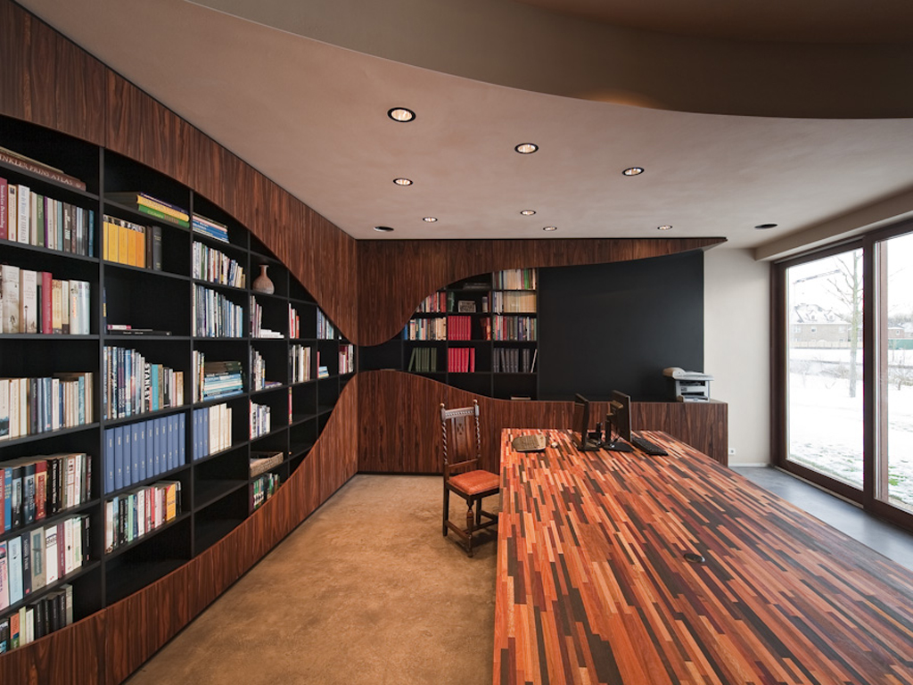
This library was designed by Reba Jones for the 2009 Millennium Tower "Icons of Design" benefit designer showcase. The architectural goal was to reinterpret the meaning and function of a library for the twenty first century. Lucite bookshelves line the long wall of the room and display art reference the ‘historical’ applications of books and literature. A row of paper along the bottom shelf appears to be ready for use, or perhaps recycling due to its obsolescence, one is not sure. A Lucite chair and stone writing desk provide a workspace facing the view while a chaise and side table are available for relaxation. Projected on the wall is a continuous series of images celebrating writers and their work.
Similar detailing and elevation treatment allow the Lucite shelves and window wall to merge and overlap blurring the intersection of view and display......more

House Interior Design | Home In The Avenues Designed By Butler Armsden

A Saarinen Womb chair and ottoman occupy the west-facing bay in the living room. Quarter-sawn maple wood floors add a Nordic feel to the main spaces. Stained glass windows were salvaged from existing cabinetry and repurposed as exterior windows.

A modern kitchen of ALNO cabinets opens to the breakfast room and garden beyond. Light fixtures include the Moooi Random Light above the breakfast table and the green Niko pendants above the kitchen island with creative use of color defining the dining and cooking spaces. Dunn Edwards "lime sorbet" paint enlivens the breakfast area and makes the connection between interior and exterior spaces..........more

Office Interior Design | 251 South Van Ness | San Francisco California Designed By Pfau Long Architecture


The micro-sized office building is the realization of a longstanding dream of the married owners to create a “total workplace” for their separate creative companies. The graphic design firm is located on the top floor and the photography studio is located below.

The envelope of the building takes its direction from the programmatic and functional elements occurring on the different floors. The building is almost completely closed to all but the northern exposure, which provides ideal daylight for studio and computer environments. The long, asymmetrical expanse of glass cuts into the alley facade and shifts the visual balance away from the front of the building. The result is optimized and balanced daylight, city views, and a new focus on the adjacent alleyway that was previously unused.......more

Apartment Interior | House M&M on the Oostelijke Handelskade in Amsterdam Designed By NEXT Architects


Type: dwelling
Location: Amsterdam
Client: private
Team: Marijn Schenk, Claudia Linders, Bart Reuser, Michel Schreinemachers, Joost Lemmens
Collaborator / associate: Claudia Linders
Floor area / size: 180 m2
Photographer: Gert Jan Kocken
Start building: may 2007
Completion: december 2007
Status: realized

The only things inside the House M&M on the Oostelijke Handelskade in Amsterdam are white cubes: no walls, no rooms, no trafficways. Or perhaps, no rooms, no walls, only trafficways. Each of the four cubes encompasses different functions, serving as a gigantic furnishing that determines the area around it. The first contains a toilet, bath and shower; the second, a wash basin and wardrobe. The third cube envelops a double bed and a bookcase, the fourth cube contains two single beds and a workplace. In this way the function of the area between the cubes is determined: the area between the first and second cubes, or between bath and wash basin, becomes the bathroom. When not in use, however, these areas revert to open space in the dwelling. The volumes of the dwelling are finished in white satin paint. The wet function areas have been treated with a polyurethane coating. On the second level of the dwelling, the cube is revisited in the form of a low-elevation square: the kitchen island, around which all the kitchen functions are arranged.....more

Apartment Interior Design | Brooklyn New York | Della Valle Bernheimer


Location: Brooklyn
Square Footage: 2,600
Type: Residential
Year: 2010
Located on the third floor of a residential tower, this amenity space combines a fitness center with a diverse entertainment program including screening room, gaming area, and demonstration kitchen. The boundary between these two programs is defined by a folded ceiling/wall covered in a metallic, patterned paper. This luminous patterned surface intersects the residential corridor to form the entrance. Once inside, the origami-like surface creates a canopy over the central lounge space. Programmed blocks bookend the ceiling to form smaller scales of gathering space - a custom reception desk, a library, and an intimate TV room. The walls peel back for entry to the gym and screening room. These rooms are characterized by deep grey tones and punctuated lighting. In contrast to these cool, dark exercise rooms, the opposing rooms by the terraces embrace the warmth of the adjacent outdoor space. A low wall of bamboo on the terraces surrounds exterior lounges and creates a backdrop for the interior lounge space. Here in the lounge, the canopy of the metal ceiling terminates by folding downward to form a sweeping bench and bar for this central gathering space for the residents of the building.....more